Da LaPosta
Project Overview
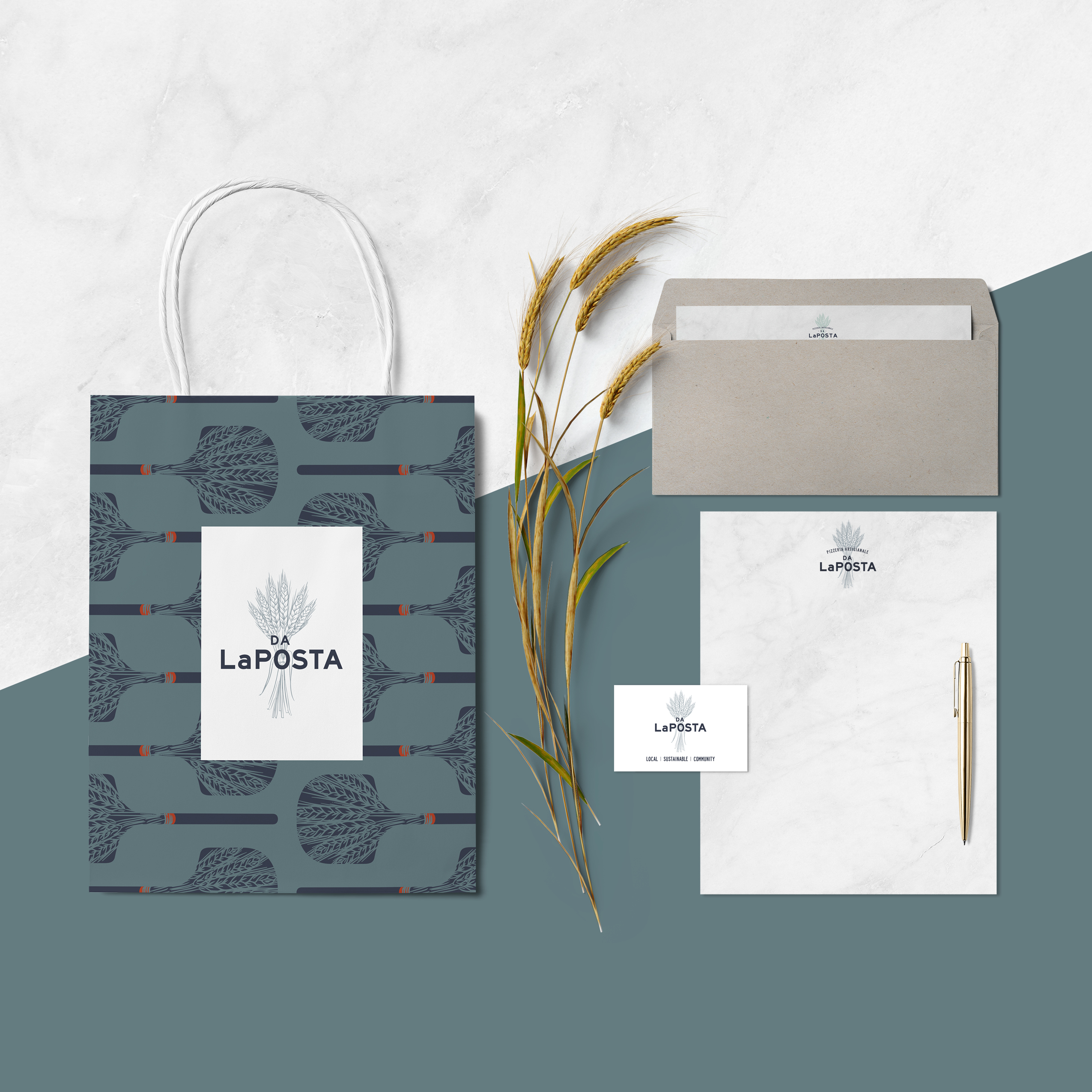
Delivered
- Logo Design
- Branding
- Menu Design
- Proposal Deck
- Excel Document Formatting
Client
- Da LaPosta Pizzeria
Completed
- May 2019
The Restaurant
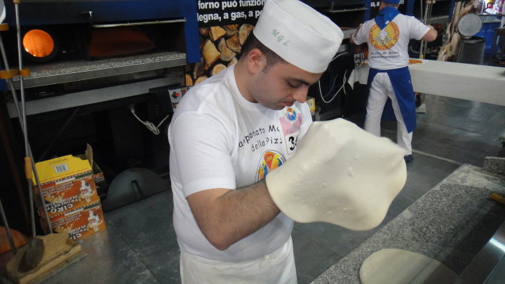
Mario LaPosta is as authentic as it gets when it come to pizza. He’s a world-class chef who studied in Italy to become a Pizziaolo (a professional pizza maker who makes pizzas in the traditional Neapolitan style.) He has built culinary and pizza programs at four restaurants, his pizza has been named 11th best in the country and has placed as high as 10th overall in the World Pizza Championships (yeah! that’s a real thing — look for the image on the left.)
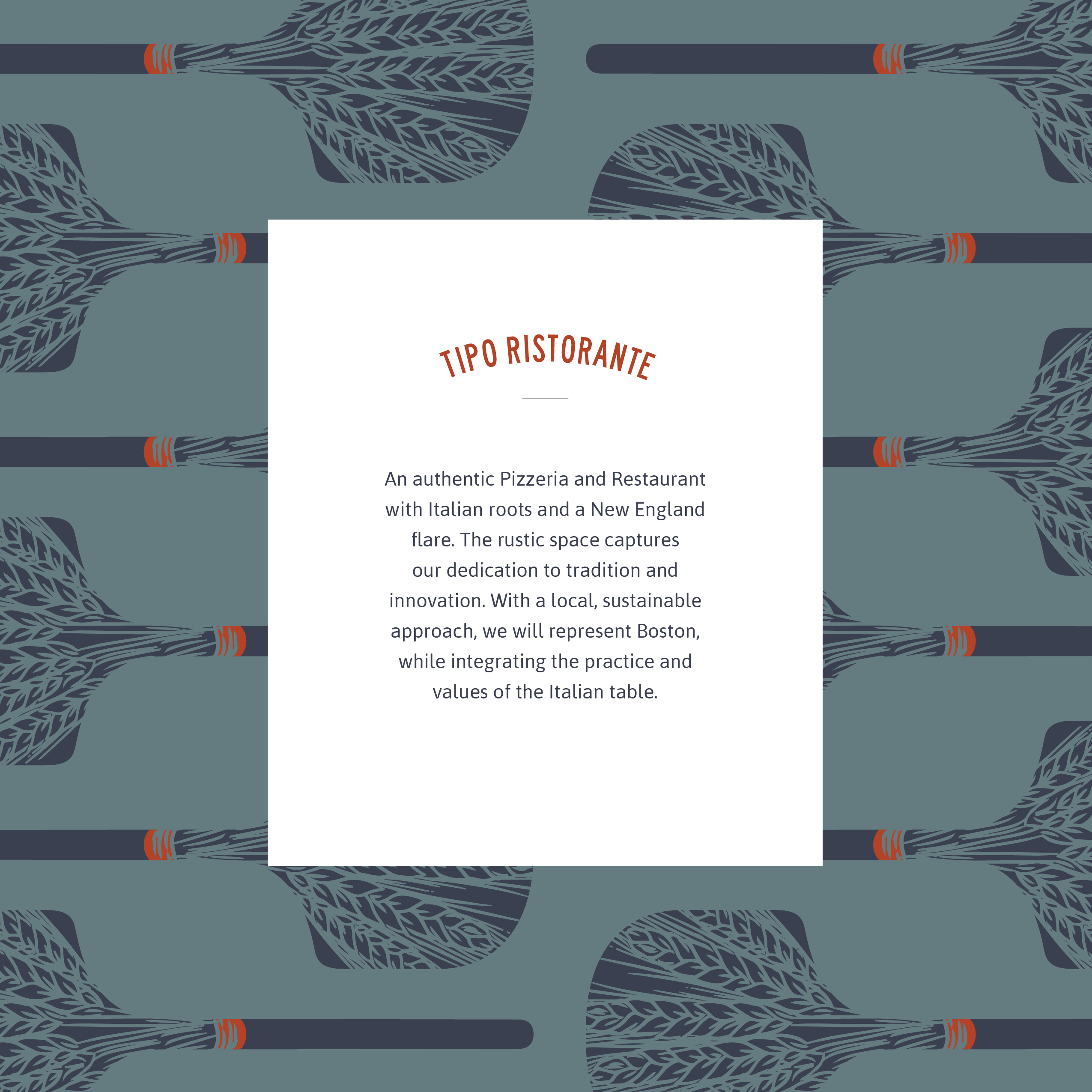
When Mario approached me to help brand his new restaurant, I already knew the passion and values that went into his cooking. His creative vision for Da LaPosta is no surprise. An authentic pizzeria with Italian roots and a New England flare, the restaurant captures his dedication to tradition and innovation. With a local, sustainable approach, Da LaPosta represents Boston while integrating the practice and values of the Italian table.
Of course…I said yes!

The Process
I wanted to bring the same passion to the project that Mario brought and understand his vision for the food and the space. This is a guy who hand-makes a 5 course meal on a Sunday because…that’s just want you do.
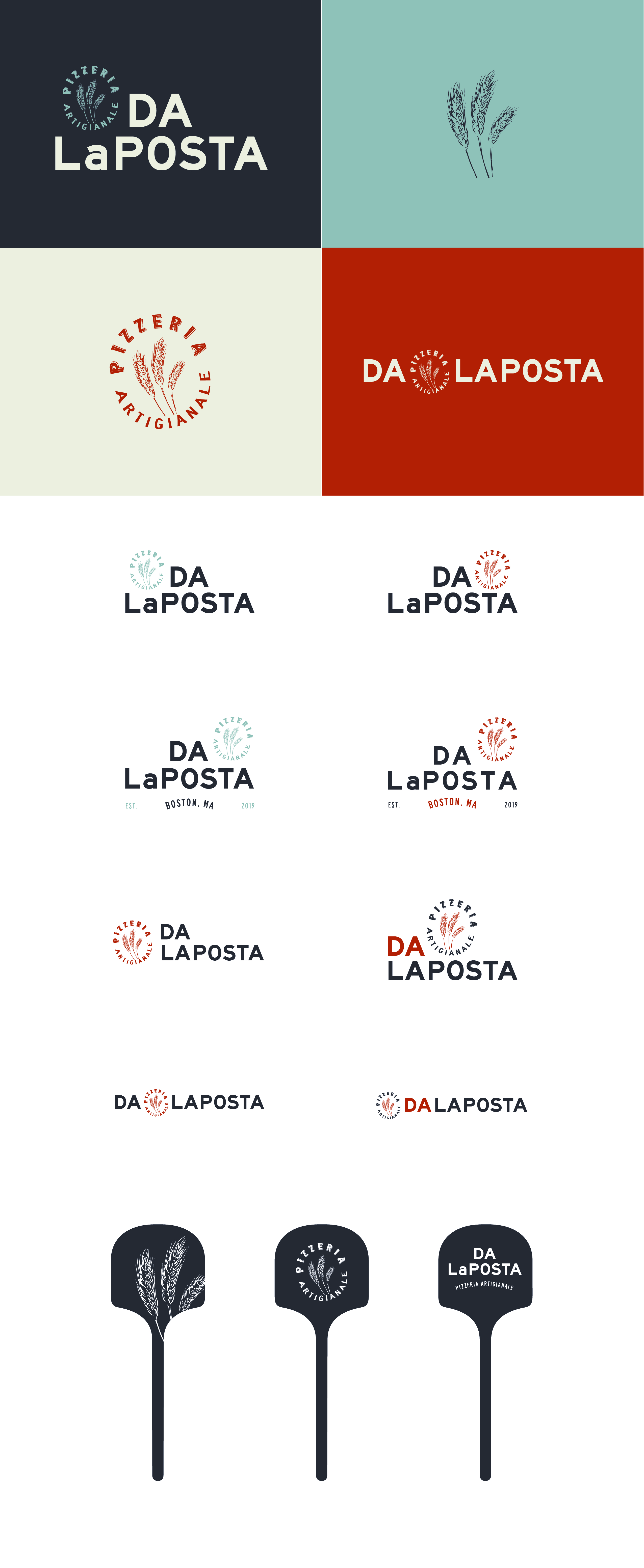
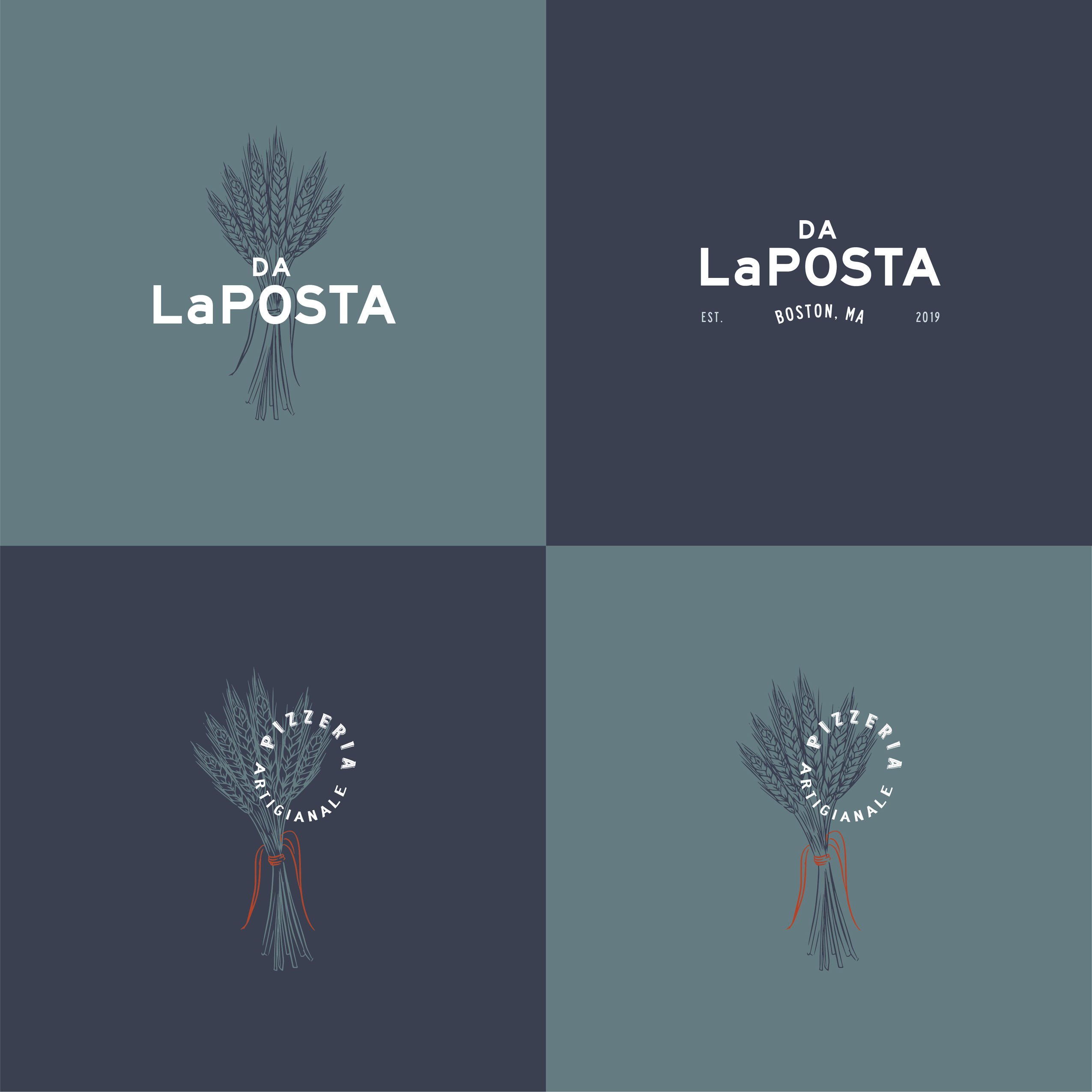
It was clear that the centerpiece of Mario’s cooking is his dough. We decided to center the branding around a wheat graphic to showcase Mario’s unique and original dough recipe.
I began with typography to set the tone for the project, aiming for a typeface that was friendly and “not too fancy.” It was important to match the vibe of the restaurant — eating with friends and family, or having Sunday dinner at Nonna’s house. Traditional cooking is the root of the brand and I wanted the typography to tie back to vintage type. To do this, I focused on adding warp effects to create arched text.
The colors are nautical and nostalgic. Ocean blues represent both the coast of Italy and New England, while the brick color is a nod to the traditional cooking method for wood-fired pizza.

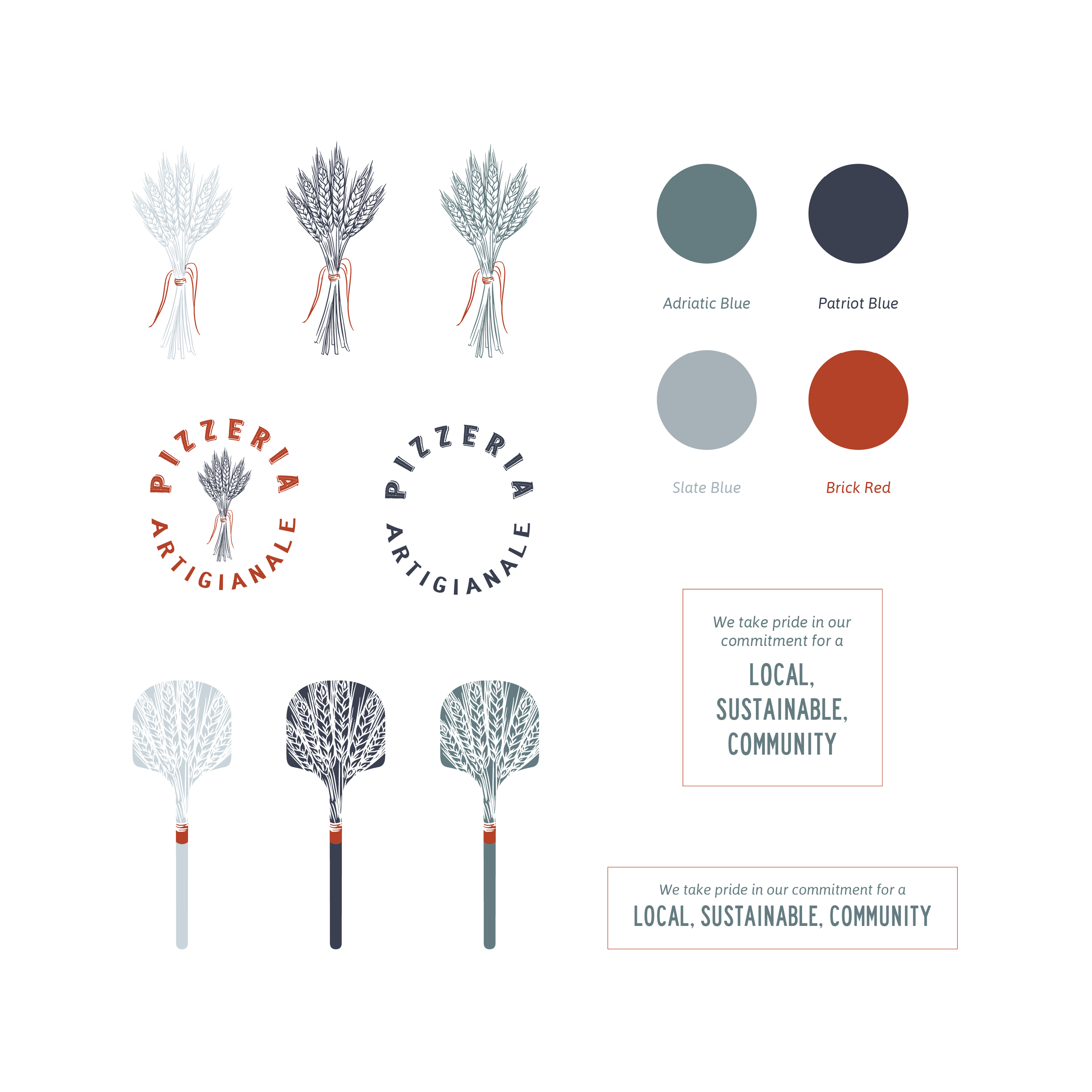
Adriatic Blue
#647b80
Patriot Blue
#3b4051
Slate Blue
#a6b2b8
Brick Red
#b44227
The Evolution
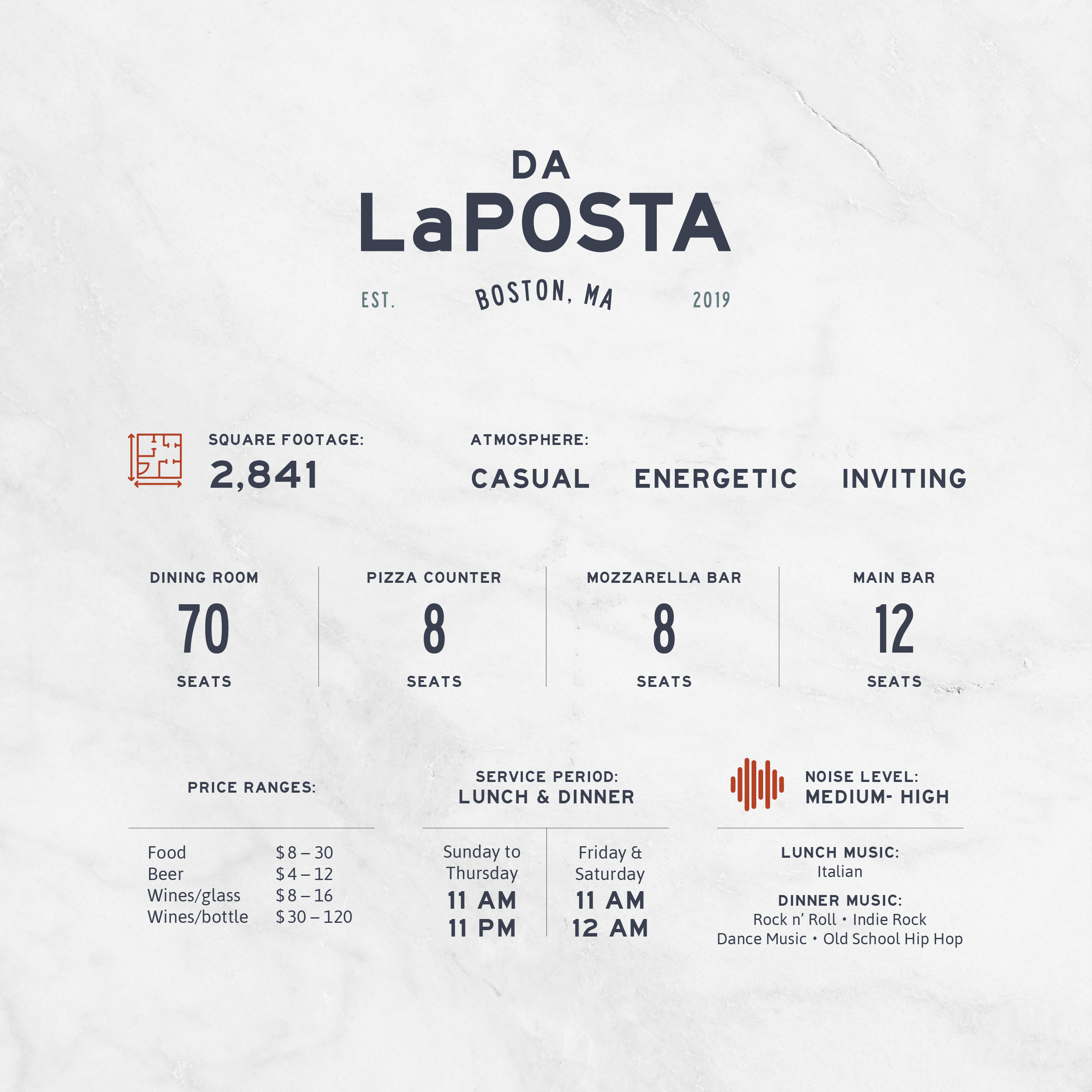
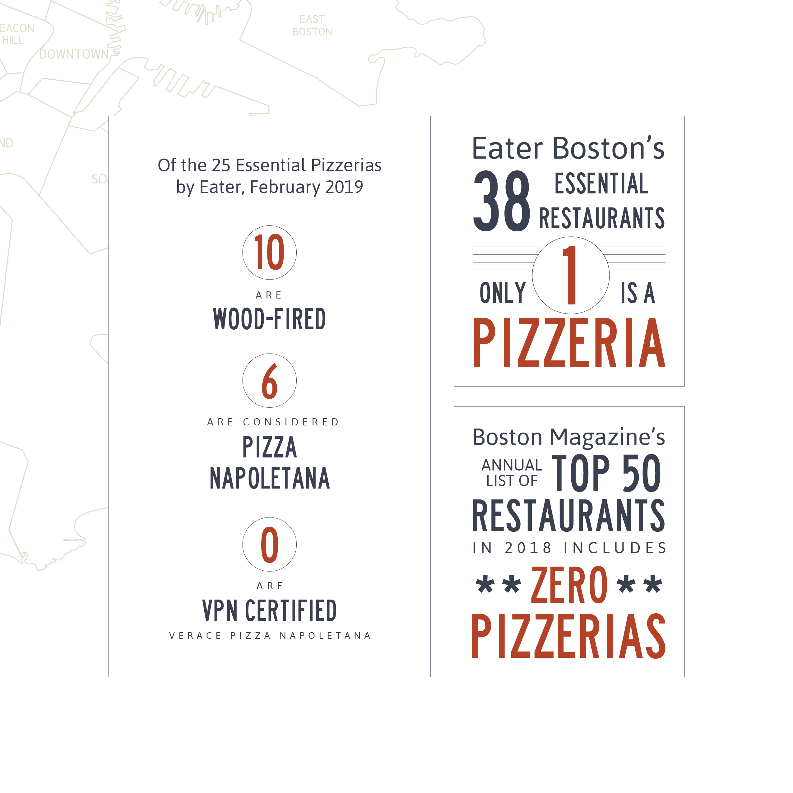
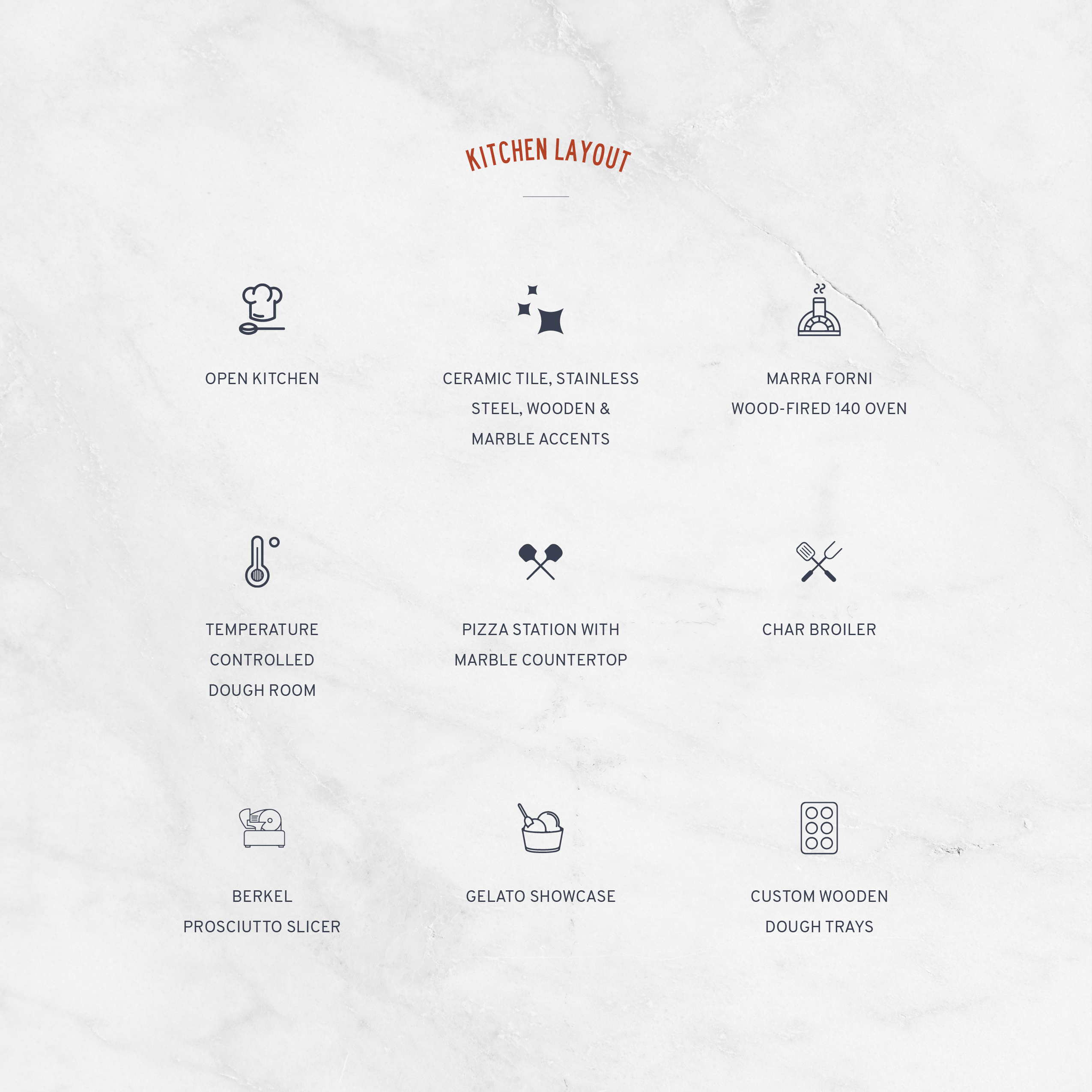
In addition to branding the restaurant, a Proposal Deck was also in the works. This detailed document told Mario’s story to investors and partners and included Mario’s resume, restaurant details, sample menus, ambiance and design examples, market analysis, branding concepts, timeline, investment structure, financial projections and terms. I wanted to paint the perfect picture of Mario’s hard work by making an awesome first impression with possible investors. Mario’s story is powerful, but adding the visuals to his dream made it come true.


Working with Jen was an amazing, eye opening experience. She brought my brand to a level of excellence, creativity, and professionalism I did not think was possible. She was communicative, and always responsive in a timely manner. Most importantly, she really cared about bringing my dream to life.
Mario LaPosta
The Misfits
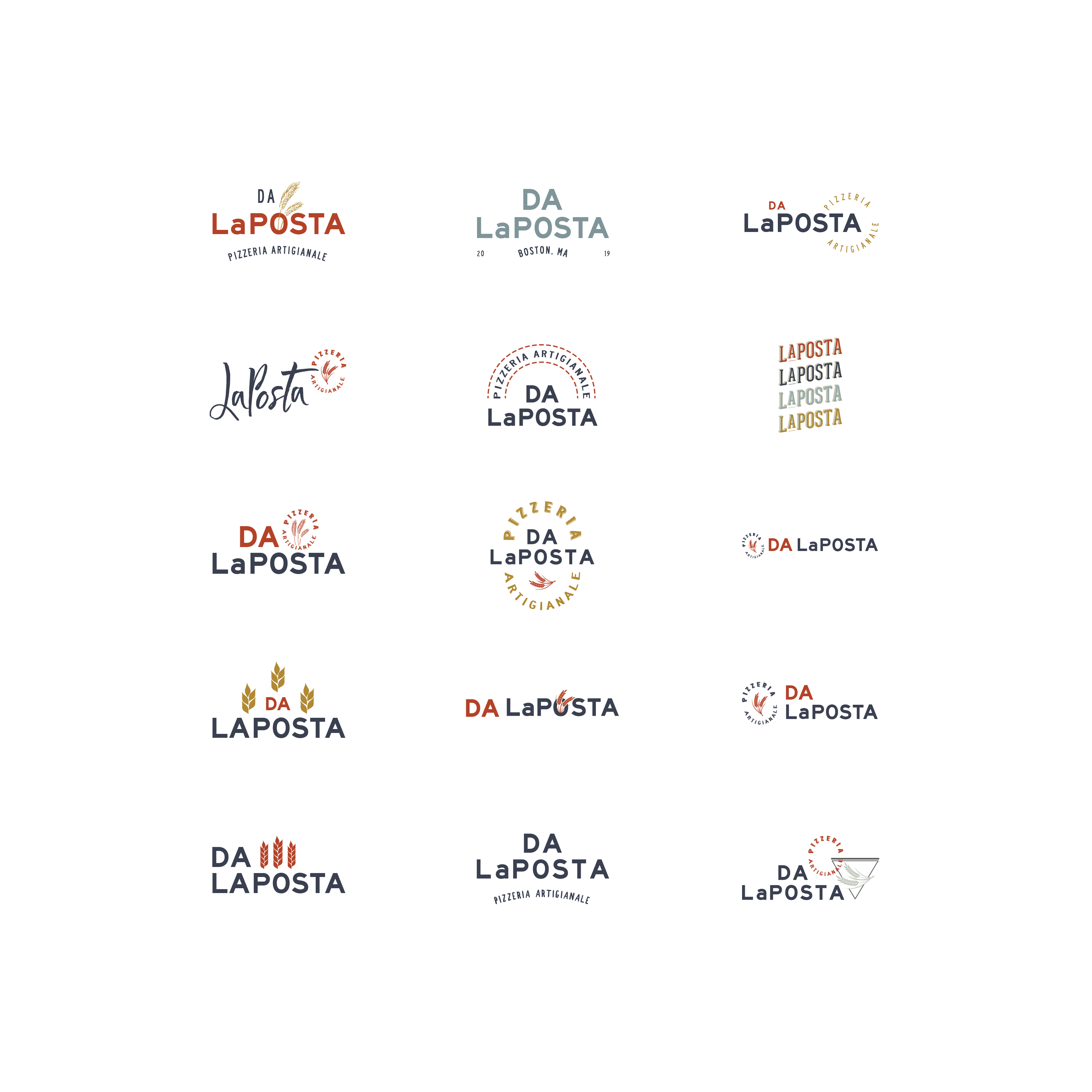
Here are some of the branding ideas that were not selected. Some of the considerations were style and placement of the wheat icon & whether the brick red was a primary or secondary color. Enjoy!
