Making a Splash

Project Overview
Delivered
- Logo Design
- Branding Materials
- Website Design
Client
- Myself
Completed
- Ongoing
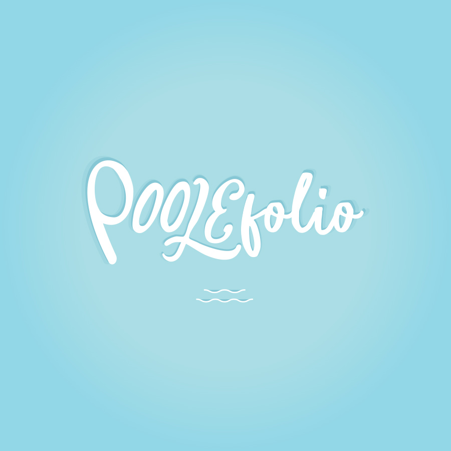
The Idea
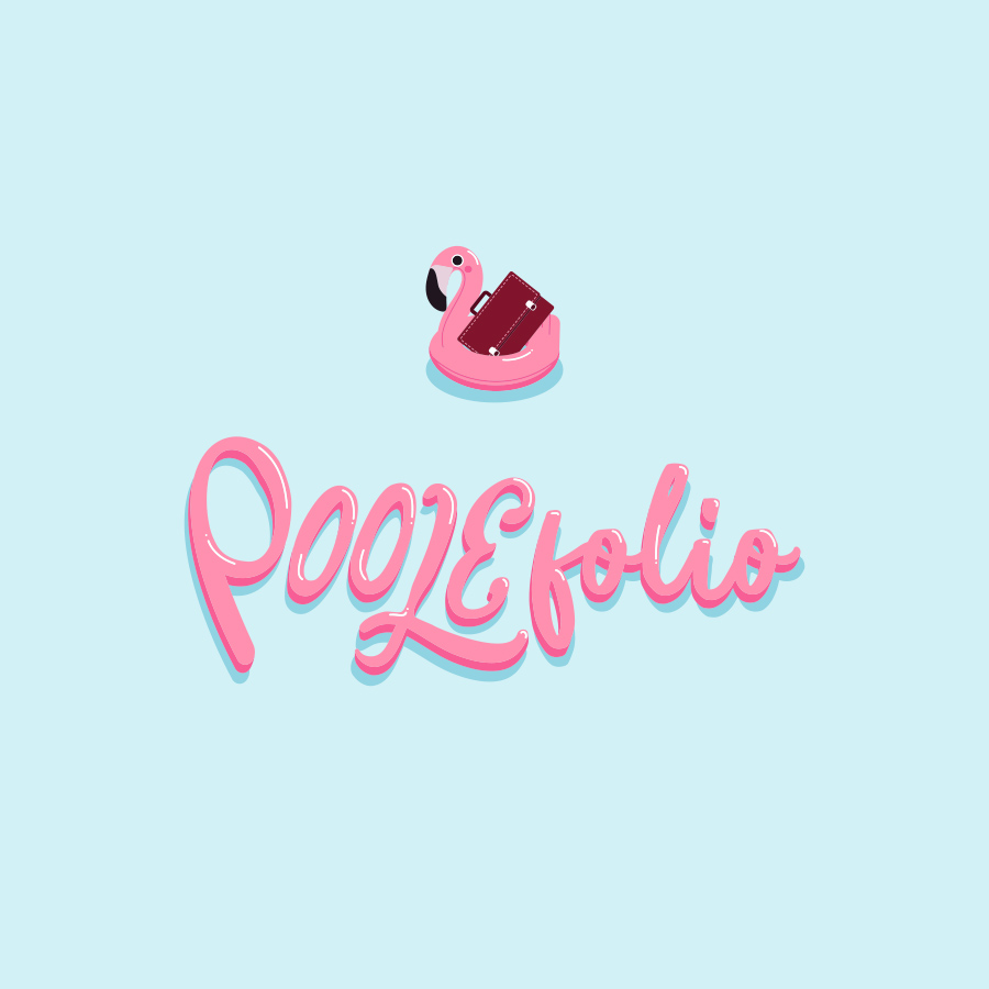
Designers always say their toughest client is themselves. I agree! I’ve revised, revamped, and redone my branding three times now, looking for the right blend. The result is POOLEfolio: a combination of my surname + portfolio. Sometimes the simplest things work the best.
The flamingo floating in the flat blue pool was the light-hearted visual I wanted to reflect my brand. Something slightly out of place that makes you do a double-take, maybe a bit tongue in cheek, but altogether clean and professional.
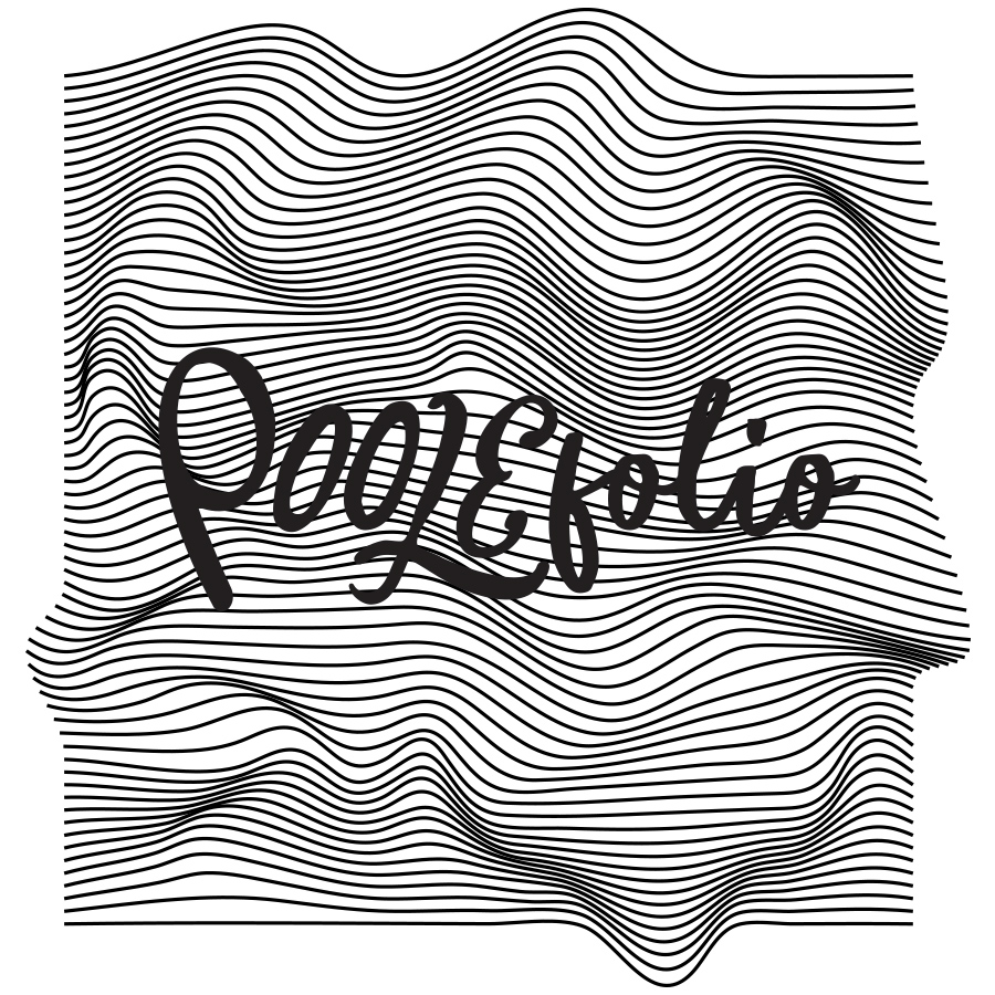
The Logo
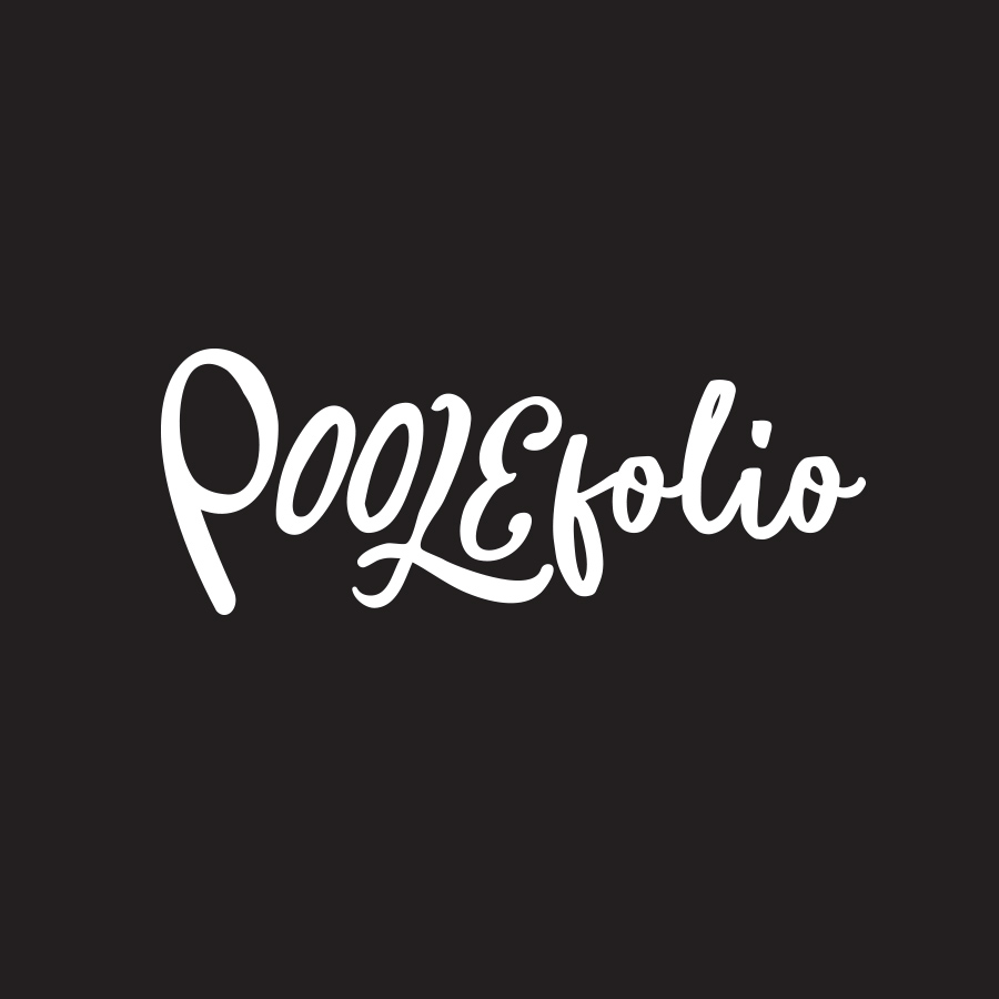
I wanted the font to feel handwritten and imperfect, not perfectly crisp with perfect leading and fairy dust sprinkled on top. Something authentic.
I learned how to be an artist from my mom. She was so good at drawing, and a damn good painter. I grew up drawing all the time, making cards for people, taking something apart just to put it back together a little different – which is exactly what this logo is. I laid out lots of different typefaces and paired up different combinations of letters. I ended up with four different typefaces that I used within the logo.
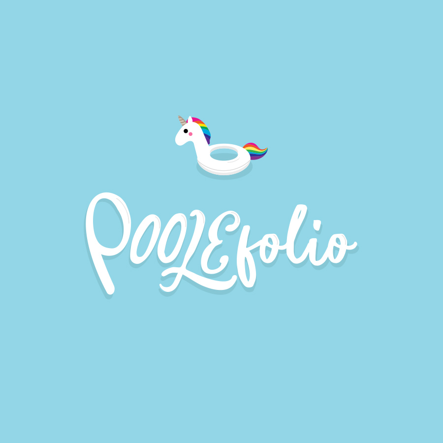
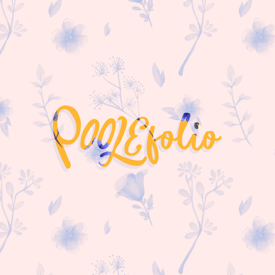
Having Fun with It
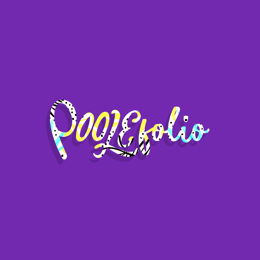
Here are some fun variations of the logo. I had the idea of using color and patterns to create diversity. The goal was to represent my adaptability as a designer.